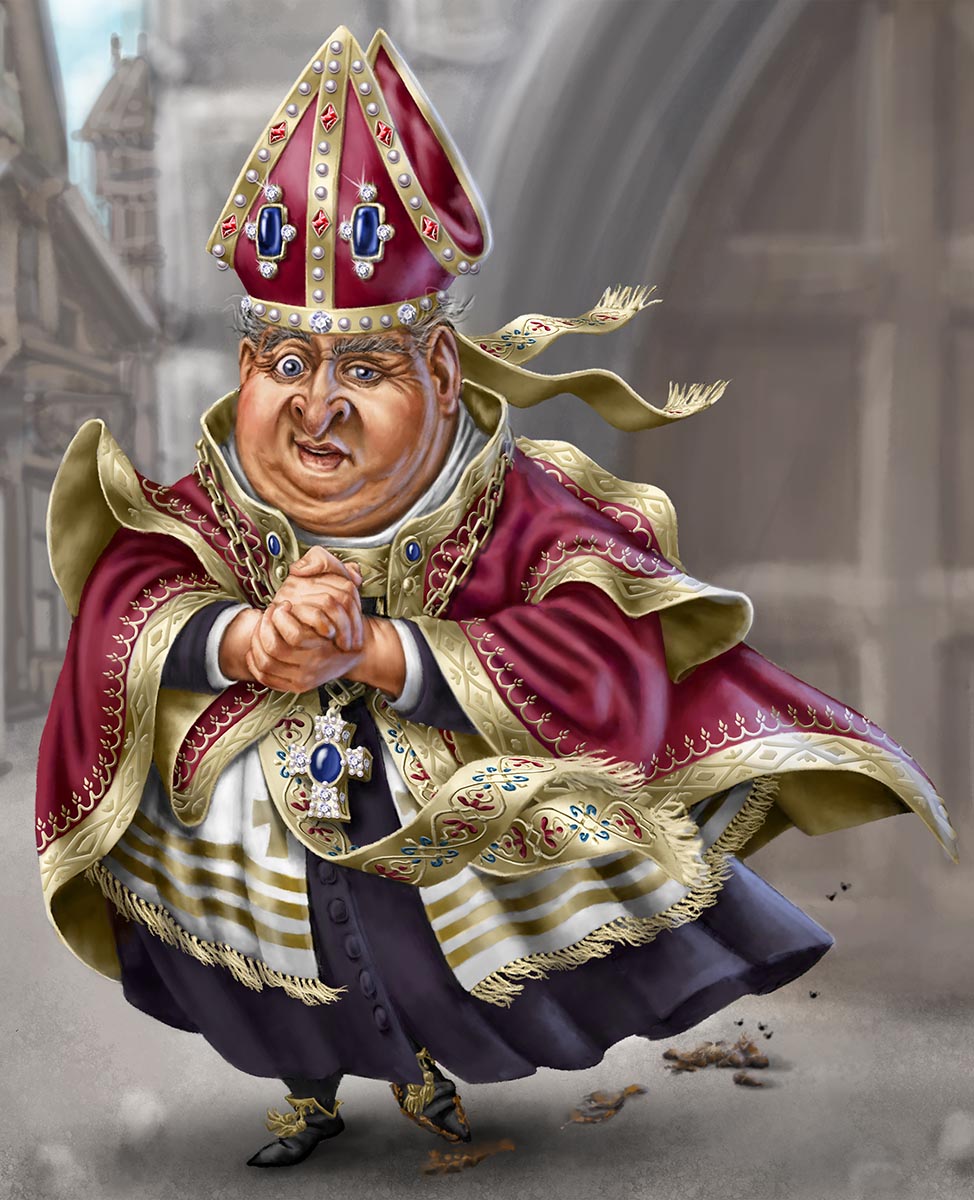
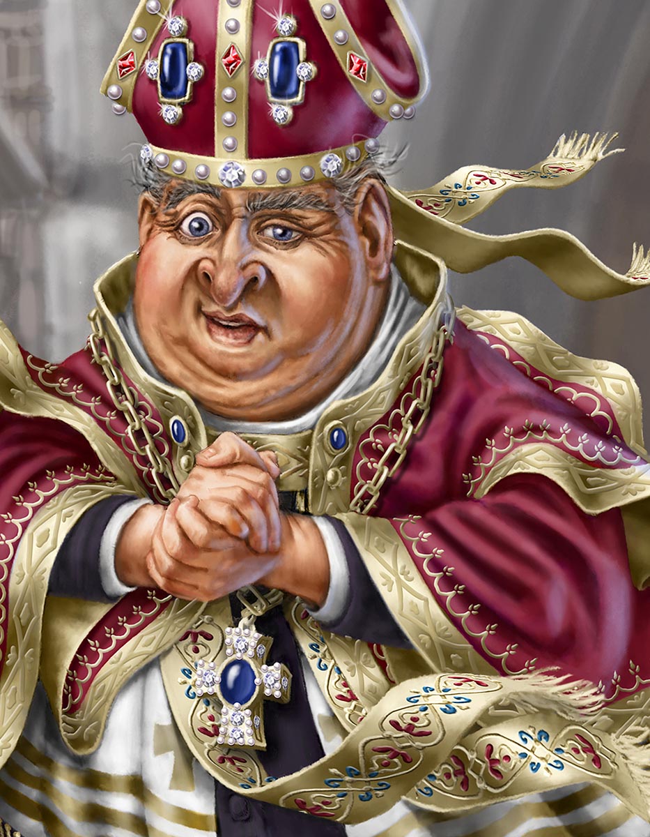
Process
Have an idea. I might make very rough “thumbnail” sketches ( tiny, fast, 1-2 inches), or doodles to explore how I might illustrate this idea.
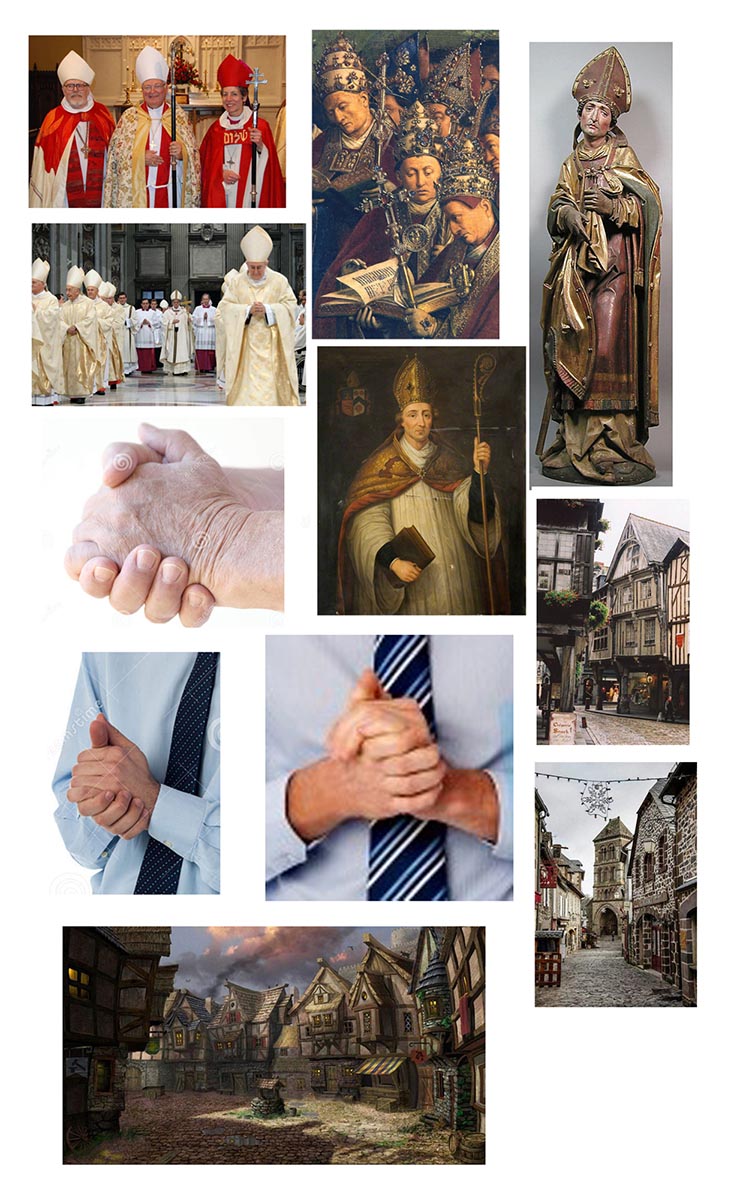
1. Gather some reference images. These help me clarify my idea, often inspire additional things I might add, and help me visualize how to portray what I plan to illustrate.
2. Sketch out a few versions of the main focus. I might try different angles, poses, and expressions. Occasionally, I like my first attempt and roll with that.
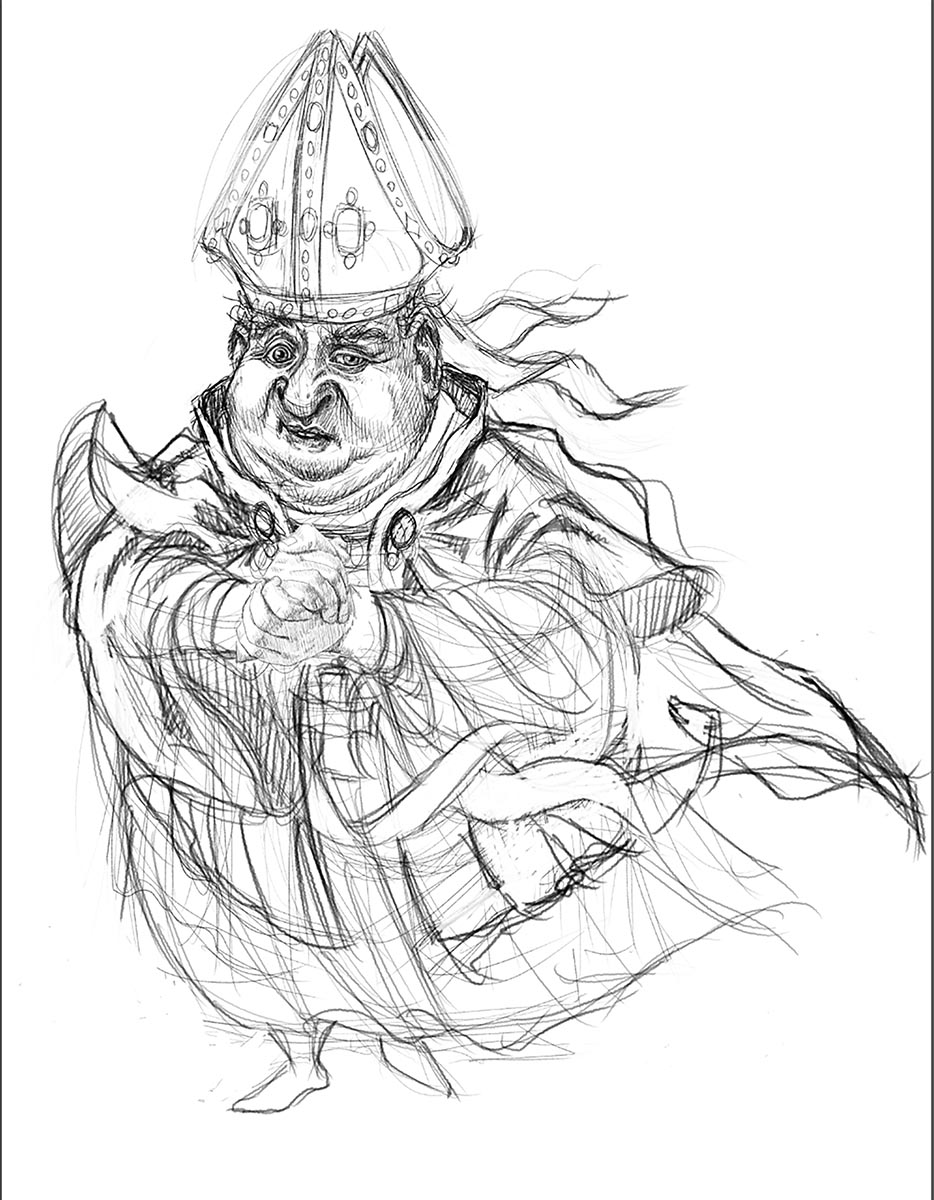
3. Make corrections and start adding details at this stage, while it’s fast and easy to change.
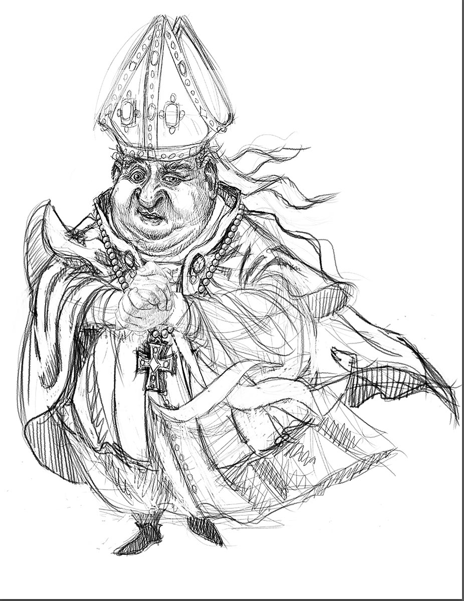
4. Add a 50% grey to the whole illustration as a base for adding shadows and light.
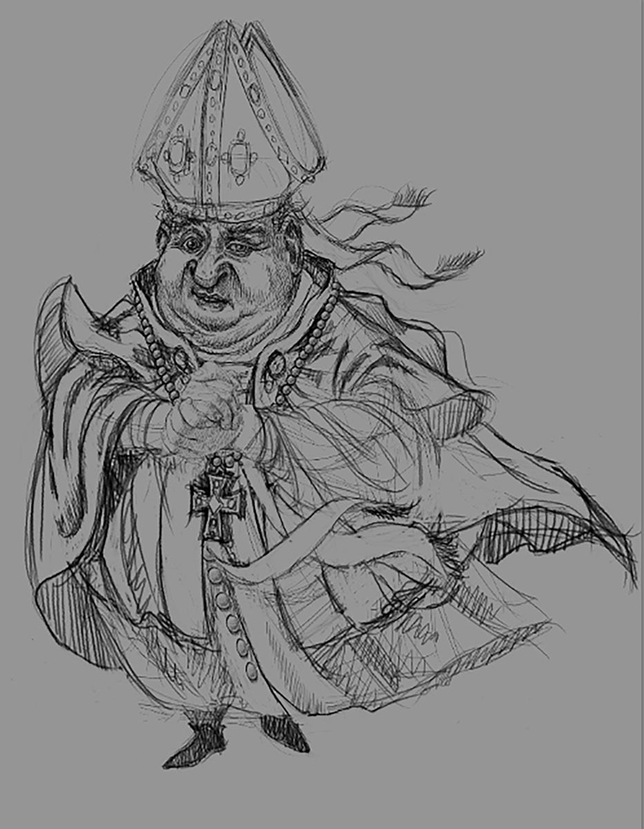
5. Using white & black, build up the volume of whatever or whoever I’m painting. Decide what direction the light is coming from to add highlights and shadows. Lighting is important to create mood, and make things look believable and 3 dimensional.
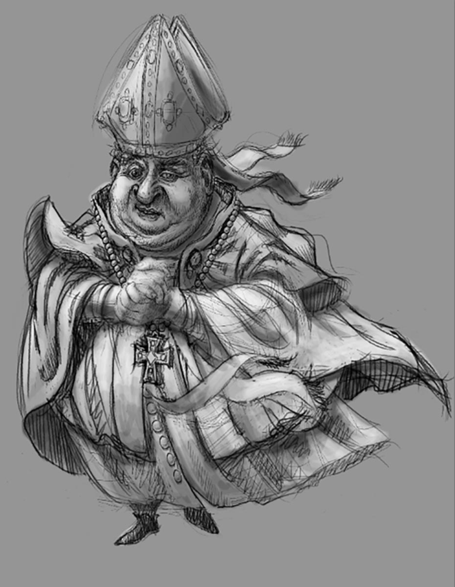
6. Erase or delete the grey background. This is where that middle grey really pays off; the contrast from the white background helps show if my highlights need to be brighter, and how dark my shadows seem. I seldom have anything pure white or black. Using the mid-grey, and alternating painting black & white, this takes about 30 minutes.
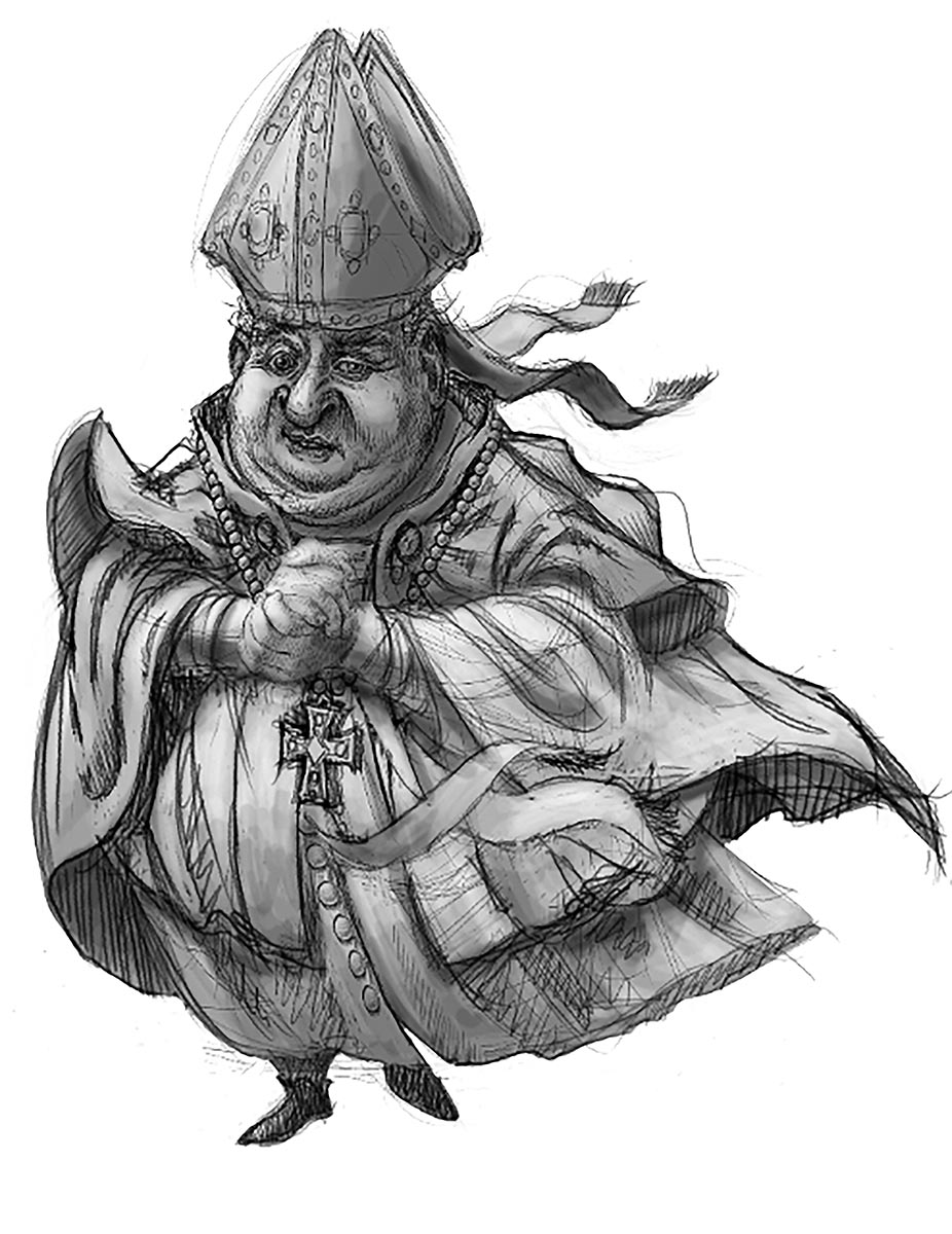
7. Roughly paint in a background to help give context to the character. Since the character is the focal point in this illustration, it can be an out-of-focus impression of the scene.
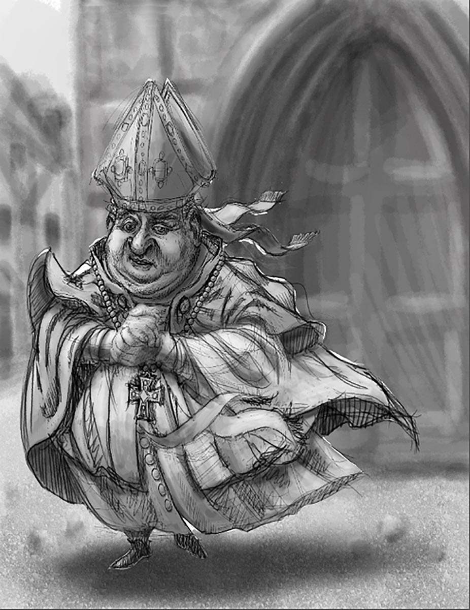
8. Smudge/blend the lines of the sketch to create more smooth gradations.
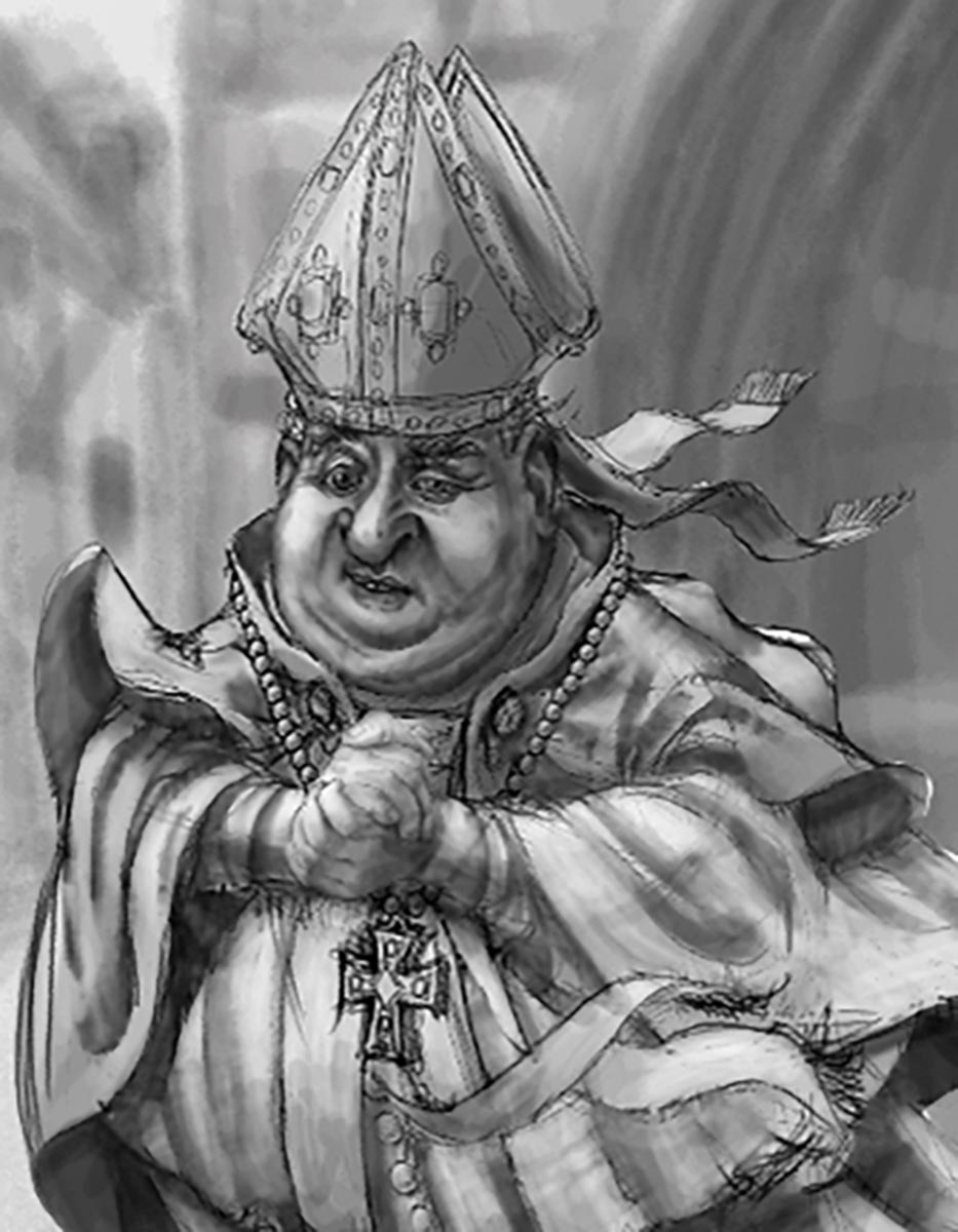
9. I ALWAYS do a “value study” as an critical part of creating art. Using various shades of grey helps me decide how light or dark, and where I need contrast to make things pop. Contrast gives it more depth, and helps establish the focal point. It’s a fast, easy way to see if the composition needs adjusting, without the complication of color. If it doesn’t work in black & white, it won’t work in color!
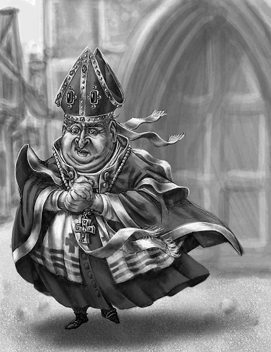
10. Add more detail to the sketch. Every material reflects light differently: the gold fabric and jewels needs to have much brighter highlights than the other fabrics or materials.
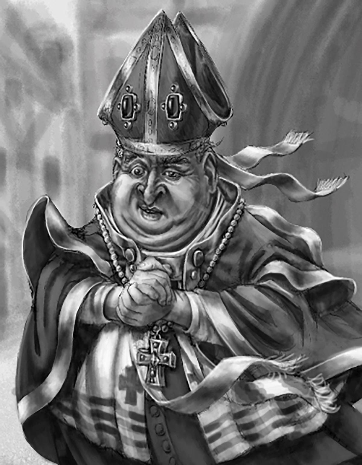
11. Since this is a digital painting, I can start to colorize the black & white art using various blending methods. The value study has helped me decide what is a dark or light “color” to speed up the color decisions. Often I start my colors on separate layers, so they can be easily changed as I work.
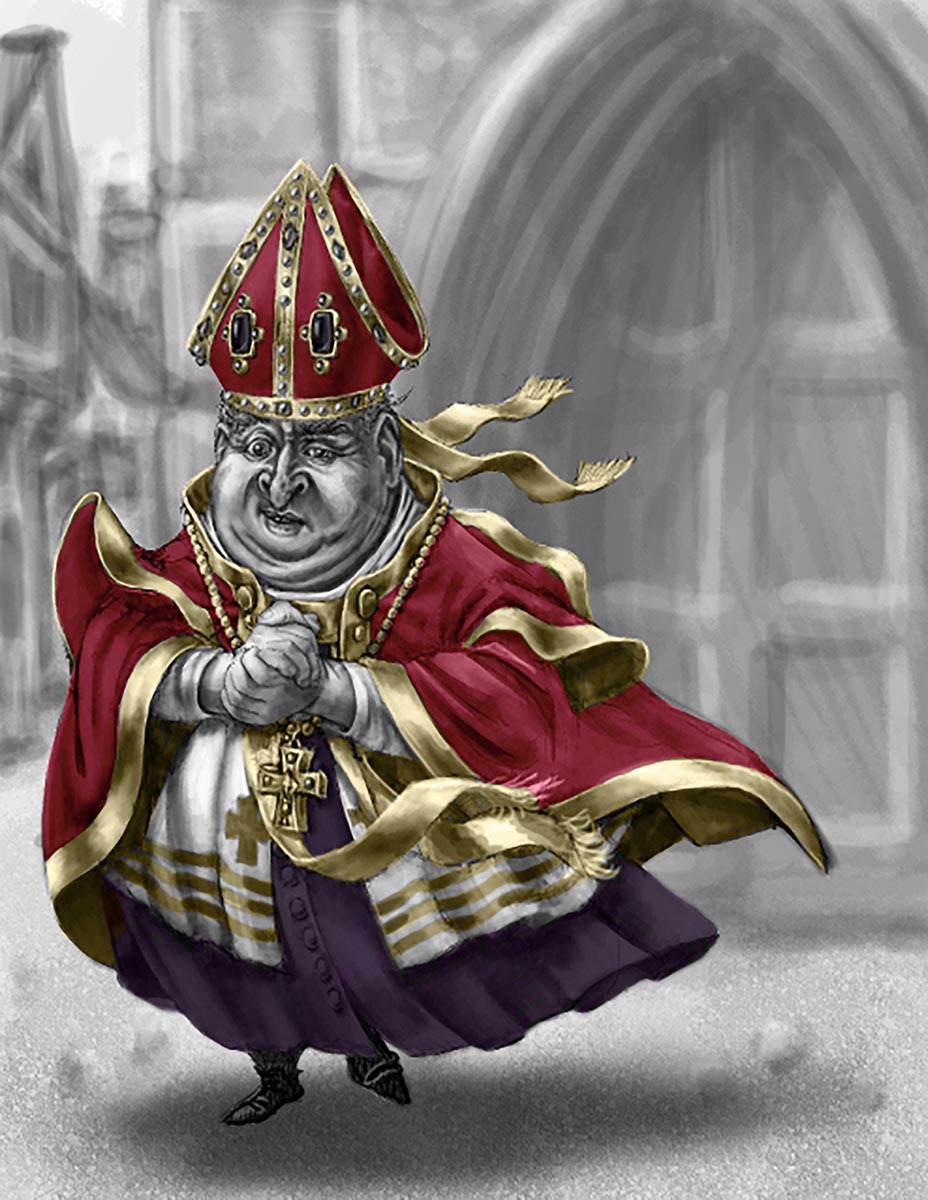
12. This way of blending keeps the shading I’ve already painted, like a glazing or sfumato technique in oil painting, and is a fast way to be sure all the colors are working well together. In no time I have a base layer that I’ll paint on top of with a much wider variation of colors.
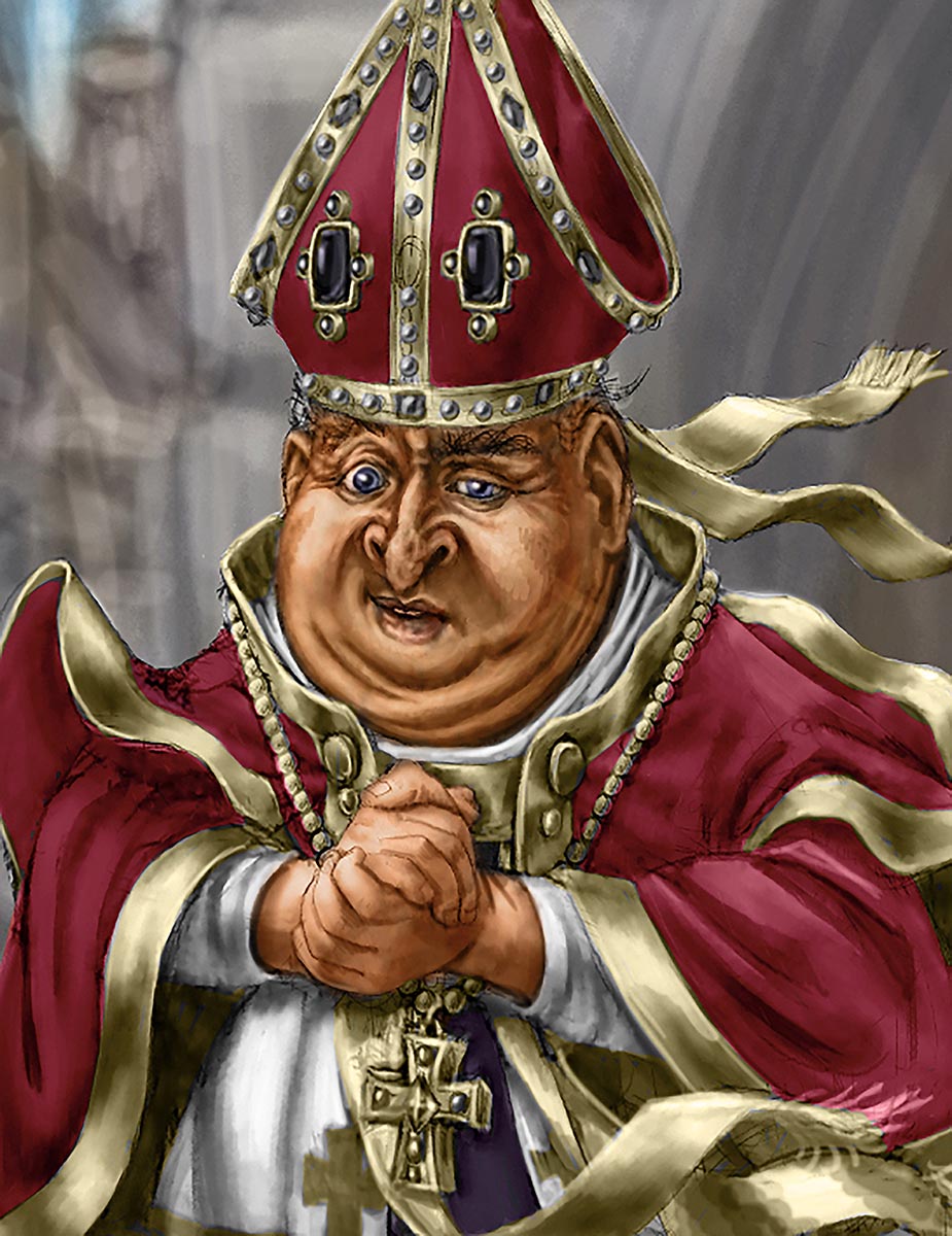
13 & 14. I add cooler hues to shadows and variations of color to skin tones; you can see my sample palette of colors I’m using just to create the skin.
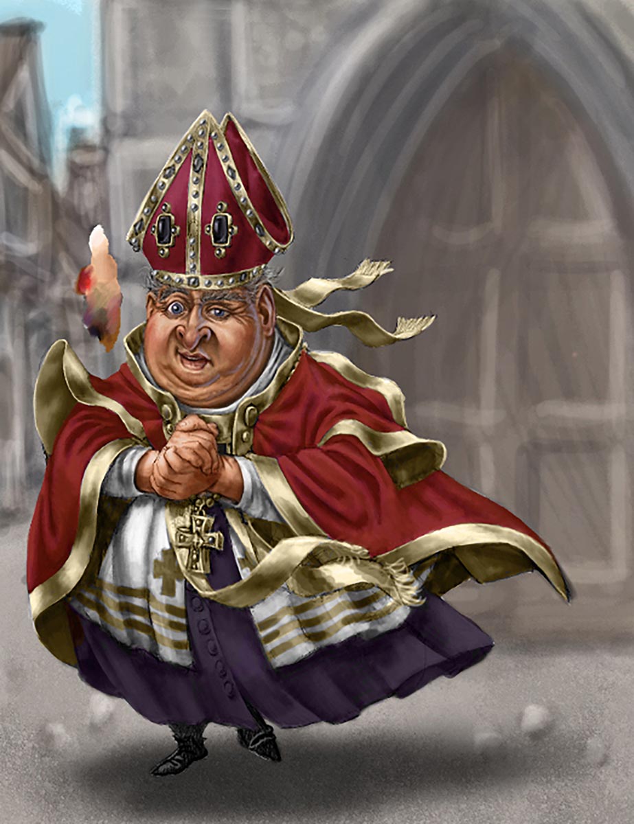
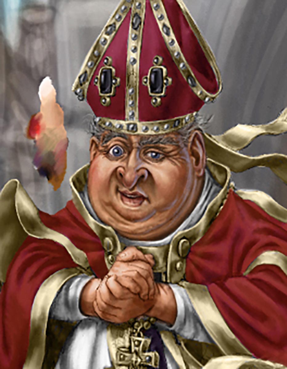
15 & 16. The final version has lots of extra details and lighting. As a digital file, many items are painted on separate layers to speed up the painting process. This painting took about 2 days to paint. If I had painted it using traditional media (oil, acrylic, or watercolor) it would probably take me about a week.
